Before heading out to the shooting range and placing Windows 10 on the target stand, let it be said that Windows 10 is a great improvement over Windows 8 and definitely a step in the right direction. However, this post is not concerned with overall impressions, neither with minor bugs which I’m certain will be ironed out over time. Rather, it sets out to highlight (call it nitpicking if you want) several annoying aspects of the redesigned window manager which I don’t expect to see changed any time soon. At first these seem like minute manageable details. However, when it comes to usability seemingly small issues can become a major annoyance when running into them on a regular basis, especially when they occur during moments of high workload where the window manager is already put under a great amount of stress.
Affordances
There is no need to go into detail about the notion of affordances (and its many interpretations), except for presenting one of the earlier definitions (The Psychology of Everyday Things, Norman 1988, p.9):
“…the term affordance refers to the perceived and actual properties of the thing, primarily those fundamental properties that determine just how the thing could possibly be used. […] Affordances provide strong clues to the operations of things. Plates are for pushing. Knobs are for turning. Slots are for inserting things into. Balls are for throwing or bouncing. When affordances are taken advantage of, the user knows what to do just by looking: no picture, label, or instruction needed.”
Within user interface (UI) design, this means UI components should thus ‘afford’ clicking, dragging, moving, or any other operation that is supported by presenting the user with clear visual clues.
Window Manager in Windows 10
As Windows evolved, the styling of application windows was designed to be more and more in line with current minimalistic trends in interface design. Styling preferences aside, unfortunately this also introduces changes in the visible affordances to work with windows. In the following figure, notice in particular how the distinction between the title bar, the menu bar, and the window border are removed in subsequent versions of Windows.

You might wonder, which affordances does this affect? Take a look at the old documentation on how to manipulate windows. In particular, I notice two major changes which bother me.
Resizing windows:
 In Windows 7, there was a visible border above which the mouse pointer changed to a resize icon. There was thus an easy visible target to point to when resizing windows.
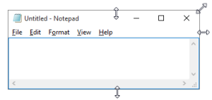
In Windows 10, all borders (except the top border) are invisible. To resize a window you need to hover over the empty area surrounding the window in order for the resize option to appear. Even more challenging is resizing the top right corner. Try figuring out where the resize option appears, as opposed to where the close button lights up! This is complicated immensely since the top border is visible (but overlayed by the close button starting from Windows 8), and the side border is invisible. Hovering over this area is quirky and unpredictable to say the least.
Moving windows:
The title bar can be used to move the application window using the mouse (click and drag). However, in Windows 10 there is no longer a visible separation between the title bar and the menu bar. [UPDATE: Microsoft has since released an update reintroducing colored title bars.] Note that the menu bar cannot be used to drag the window. The pointing task to move a window is thus complicated since there are no visual clues to determine whether a window can be dragged from a given position (not even on hover). However, since it seems the menu bar has been removed for modern Windows applications, this is mainly a problem for classic desktop applications (and will be until they are phased out).
Discussion
In line with the concept of affordances, Microsoft’s user experience checklist for desktop applications states the following:
Never require users to click an object to determine if it is clickable. Users must be able to determine clickability by visual inspection alone.
- Primary UI (such as commit buttons) must have a static click affordance. Users shouldn’t have to hover to discover primary UI.
- Secondary UI (such as secondary commands or progressive disclosure controls) can display their click affordance on hover.
- […]
For your convenience, the definitions (taken from Microsoft’s glossary) of some of the more obscure concepts listed above:
commit button—A command button used to commit to a task, proceed to the next step in a multi-step task, or cancel a task. […]
primary command—A central action that fulfills the primary purpose of a window. For example, Print is a primary command for a Print dialog box. […]
secondary command—A peripheral action that, while helpful, isn’t essential to the purpose of the window. For example, Find Printer or Install Printer are secondary commands for a Print dialog box. […]
progressive disclosure—A technique of allowing users to display less commonly used information (typically, data, options, or commands) as needed. For example, if more options are sometimes needed, users can expose them in context by clicking a chevron button.
Using this terminology it can thus be argued Microsoft now considers window operations to be ‘secondary commands’, as opposed to ‘primary commands’. Personally I don’t find what in essence are invisible UI components good design, regardless of whether their functionality becomes visible on hover. More importantly, the lack of any visual distinction (even on hover) between the title bar and the menu bar contradicts Microsoft’s own design guidelines. It seems like usability took a backseat to styling, just for the sake of having a ‘flat’ look.

One thought on “Missing Affordances in Windows 10”